Graphs
You can see the graph of a target by clicking on a target in a care plan. Graphs enable the BCBA to visualize a learner’s progress through plotted data points.
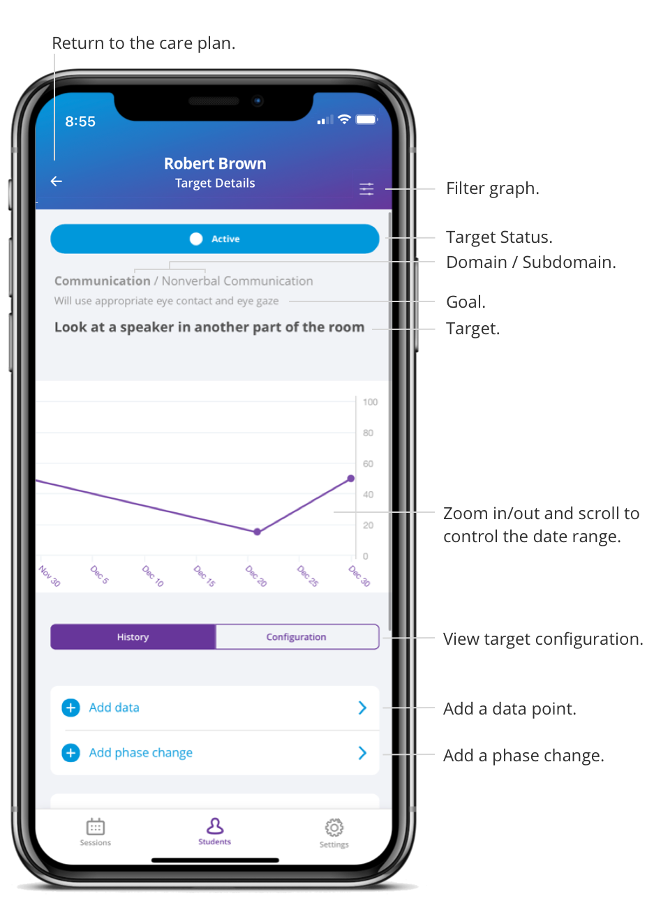
The Y axis labels change based on the form of measure and the X axis displays the dates. You can zoom in and out on the graph to control how many dates are being displayed and go back or forward in time by tapping and dragging your finger horizontally.
The filter, in the top right corner, can be used to view data points collected by a specific provider on the graph.
Condition changes and data points can be added to the graph if the target is at an in-progress status (Baseline, Active, or Maintenance).
note
When there are multiple data points collected on the same day, for targets with a form of measure that scores as a percentage, the average of the scores will be plotted on the graph. For targets with a form of measure that scores as a count, the sum of the scores will be plotted on the graph.
Target History#
Under the History tab, you can see all activity regarding the target:
- Condition changes
- Data points from sessions
- Manually added data points
Orange data points are considered incomplete, because the minimum trials configured for that target was not collected. Incomplete data points are not plotted on the graph.
You can select a data point from the history list to see additional details:
- Score
- Trial responses
- Date of session
- Provider